A swift guide to design principles

A design, according to Wikipedia, is a plan or specification for the construction of an object or system, for the implementation of an activity or process, or the outcome of that plan or specification in the form of a prototype, product, or process.
Design is the process of making things look nice – a decoration or Art. However, design is both an art and a science. The process is cold and calculated. Being pretty can sometimes be detrimental. However, the design cannot fail. Design is for everyone, not just a select few. Website and mobile app design, as well as design in general, is a complex yet subtle process that entails more than just making things look nice.
Design is a plan for arranging elements in such a way as best to accomplish a particular purpose.”
― Charles Eames, an American designer.
What we hear, see, think, feel, and do have an impact on design. The majority of you who are new to design believe that your design is one-of-a-kind. The problem is that nothing about the design is unique because what we usually do with design is improve on another design.
As you begin your design journey, please keep the following in mind:
1. Design isn't about originality.
2. Designers are not consumers.
3. Designers are compassionate.
4. Design is not a stage of the project, but rather a component of it.
5. Design simplicity does not imply minimalism.
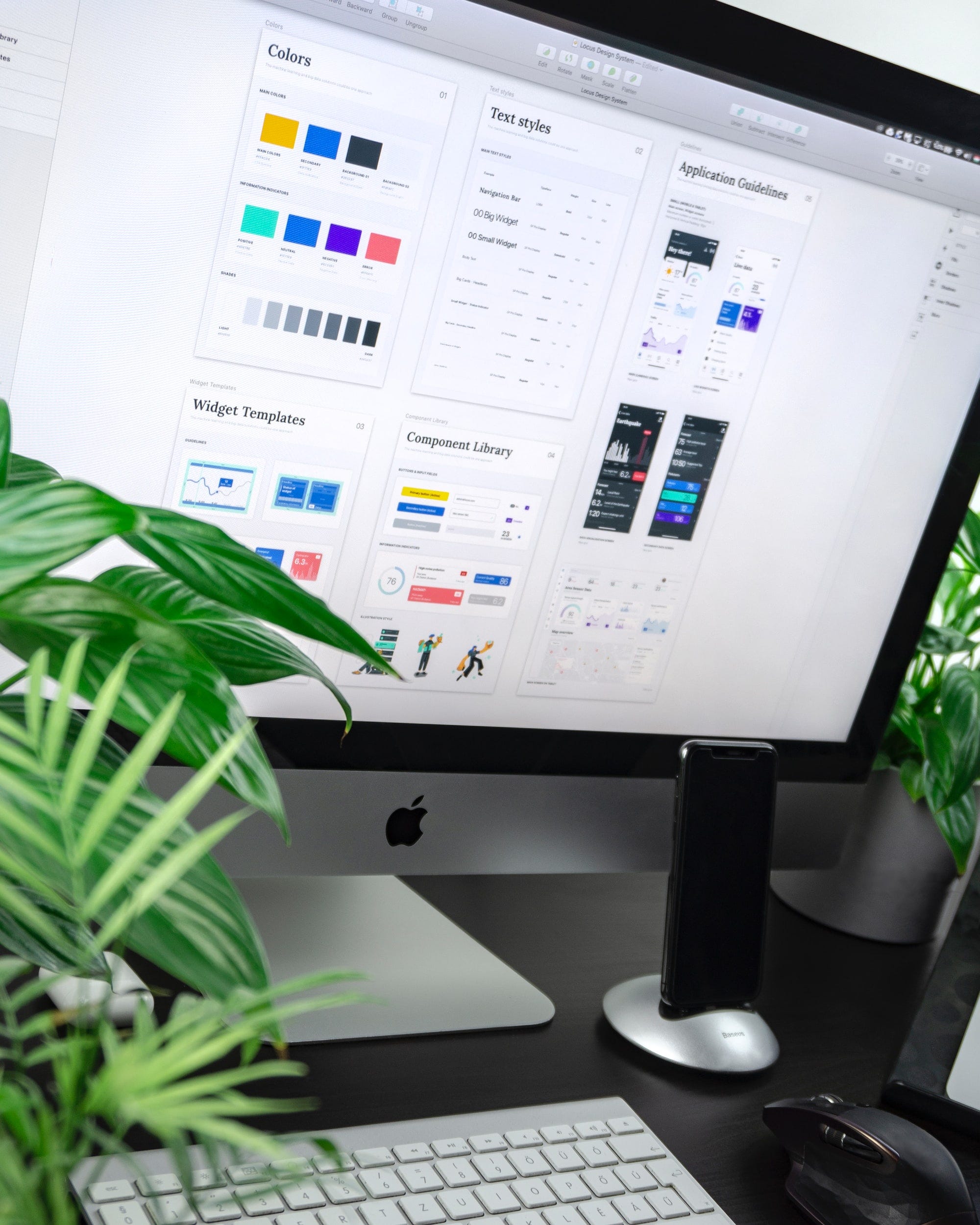
Design principles
What exactly are design principles?
These are the rules that a designer must follow to create effective and efficient designs. The following are the principles:
Contrast: is frequently associated with readability, legibility, and accessibility. Contrast is the difference between two or more objects in a design. The distinction between objects could be light and dark, thin and thick, small and large, bright and dull balance: refers to the visual weight, or impact, of the composition's elements. Typography, colors, images, shapes, patterns, and other design elements all have visual weight. Some elements are heavy and draw the eye, while others are lighter and less noticeable.
Balance: refers to the visual weight or impact of the composition's elements. Typography, colors, images, shapes, patterns, and other design elements all have visual weight. Some elements are heavy and draw the eye, while others are lighter and less noticeable. Balance is classified into two types: symmetrical and asymmetrical. Symmetrical designs place equal-weight elements on either side of an imaginary center line. Asymmetrical balance employs elements of varying weights, which are frequently arranged about a line that is not centered within the overall design.

Emphasis: focuses on the elements of a design that are meant to stand out In most cases, this refers to the most important information conveyed by the design. Adding emphasis to an object creates a focal point, which draws the attention of the audience. It is where you want the viewer's attention to be drawn first, but it does not overpower the rest of the design (or it would be out of balance).
Proportion: is the relationship between the sizes of elements. It can be used in conjunction with other principles such as emphasis to draw the viewer's attention to a focal point and aids in the interpretation of designs or imagery.
Hierarchy: It refers to the importance of elements within a design.How items are ranked against each other.
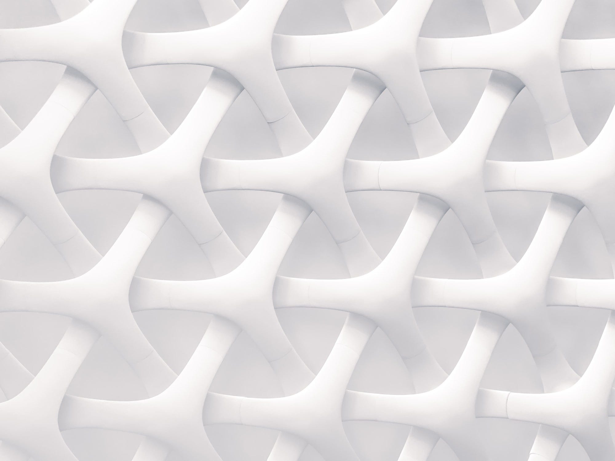
Repetition: It refers to the significance of various elements in a design. It refers to the significance of design elements. It's also a great way to unify a design that incorporates many different elements. Repetition can take many forms, including repeating the same colors, typefaces, shapes, or other design elements.
Rhythm: Similar to how the space between notes in a musical composition creates rhythm, the spaces between repeating elements can cause a sense of rhythm to form.
The repetition of an object throughout the composition creates a pattern. We can use patterns to draw focus and emphasis on our subject by including them. They help to distinguish and remember the composition as a whole.
Whitespace:(or negative space) is the only one that specifically deals with what you don’t add.
Movement: Controlling the elements in a composition so that the eye is led from one to the next and the information is properly communicated to your audience is what movement is all about.
Design variety: is used to create visual interest. A design that lacks variety can quickly become monotonous, causing the user to lose interest. Color, typography, images, shapes, and virtually any other design element can be used to create variety.
Unity: Unity is a force operating within a design that gives it the appearance of oneness or resolution.