Understanding Wireframes

A website wireframe, also known as a page schematic or screen blueprint, is a visual guide that represents the skeletal framework of a website. [1]: 166 The term wireframe is taken from other fields that use a skeletal framework to represent 3-dimensional shape and volume. [2] Wireframes are created to arrange elements to best accomplish a particular purpose.``` Wikipedia
The exploratory stage of the product life cycle is often when the wireframing process takes place. The designers are evaluating the product's scope, work together on concepts, and determine the needs of the business throughout this stage. A wireframe is typically the first version of a website and is used as a starting point for the design of the final product.
Why are wireframes used?
There are three main uses for wireframes:
- They maintain the user-focus of the concept
- Define and explain website functionality.
- They are quick and inexpensive to produce.
Different types of wireframe
There are three main types of wireframes:
- Low-fidelity wireframes
- Mid-fidelity wireframes
- High-fidelity wireframes.
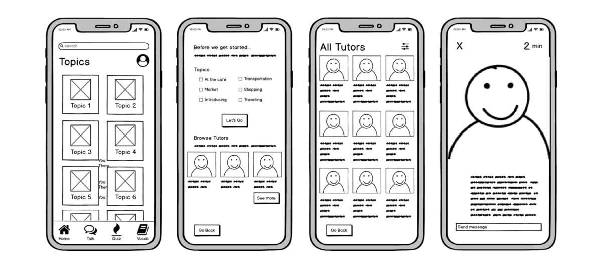
Low-fidelity wireframes: are basic visual representations of the webpage and usually serve as the design’s starting point. As such, they tend to be fairly rough, created without any sense of scale, grid, or pixel accuracy.
Low-fidelity wireframes omit any detail that could potentially be a distraction and include only simplistic images, block shapes, and mock content—such as filler text for labels and headings.

Mid-fidelity wireframes
The most commonly used wireframe of the three, mid-fidelity wireframes features more accurate representations of the layout. While they still avoid distractions such as images or typography, more detail is assigned to specific components, and features are differentiated from each other.

High-fidelity wireframes
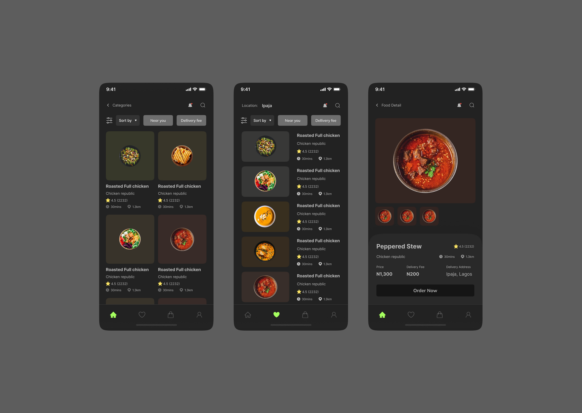
Finally, high-fidelity wireframes boast pixel-specific layouts. Where a low-fidelity wireframe may include pseudo-Latin text fillers and grey boxes filled in with an ‘X’ to indicate an image, high-fidelity wireframes may include actual featured images and relevant written content.

What is included in a wireframe?
As we touched on earlier, how many features are included in a wireframe depends largely on whether the wireframe is low, mid, or high fidelity. However, elements that are typically found in wireframes include logos, search fields, headers, share buttons, and pseudo-Latin (Lorem Ipsum) placeholder text.
High-fidelity wireframes may also include navigation systems, contact information, and footers. Typography and imagery should not be part of a low or mid-fidelity wireframe—but designers often play with the sizing of the text to represent the information hierarchy or indicate a header.
Wireframes are traditionally created in greyscale, so designers often play around with shading—using lighter shades of grey to represent light colors, and darker shading to represent bolder colors. In high-fidelity wireframes, designers may throw in the occasional color; such as red to indicate a warning or error message, or dark blue to represent an active link.
As wireframes are two-dimensional, it’s important to bear in mind that they don’t do well with showing interactive features of the interface like drop-downs, hover states, or accordions that implement show-hide functionality.
Conclusion
A wireframe is required if you are working on a digital design project for your website. You will, in fact, need to make several. Begin with a low-fidelity wireframe and progress to more detailed, high-fidelity wireframes as you collaborate to design your final masterpiece.


